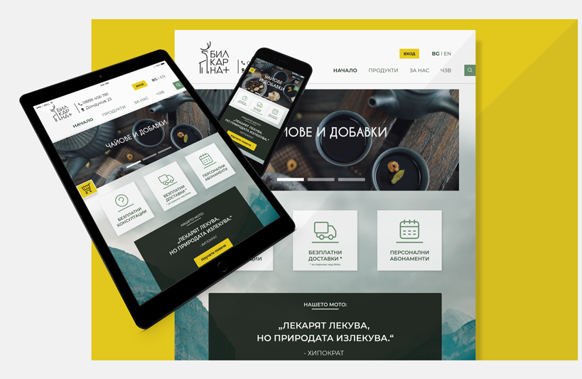
duration
2 weeks
team
Solo Project
tools
Adobe XD,
Adobe Illustrator
my role
UX/UI design

2 weeks
Solo Project
Adobe XD,
Adobe Illustrator
UX/UI design
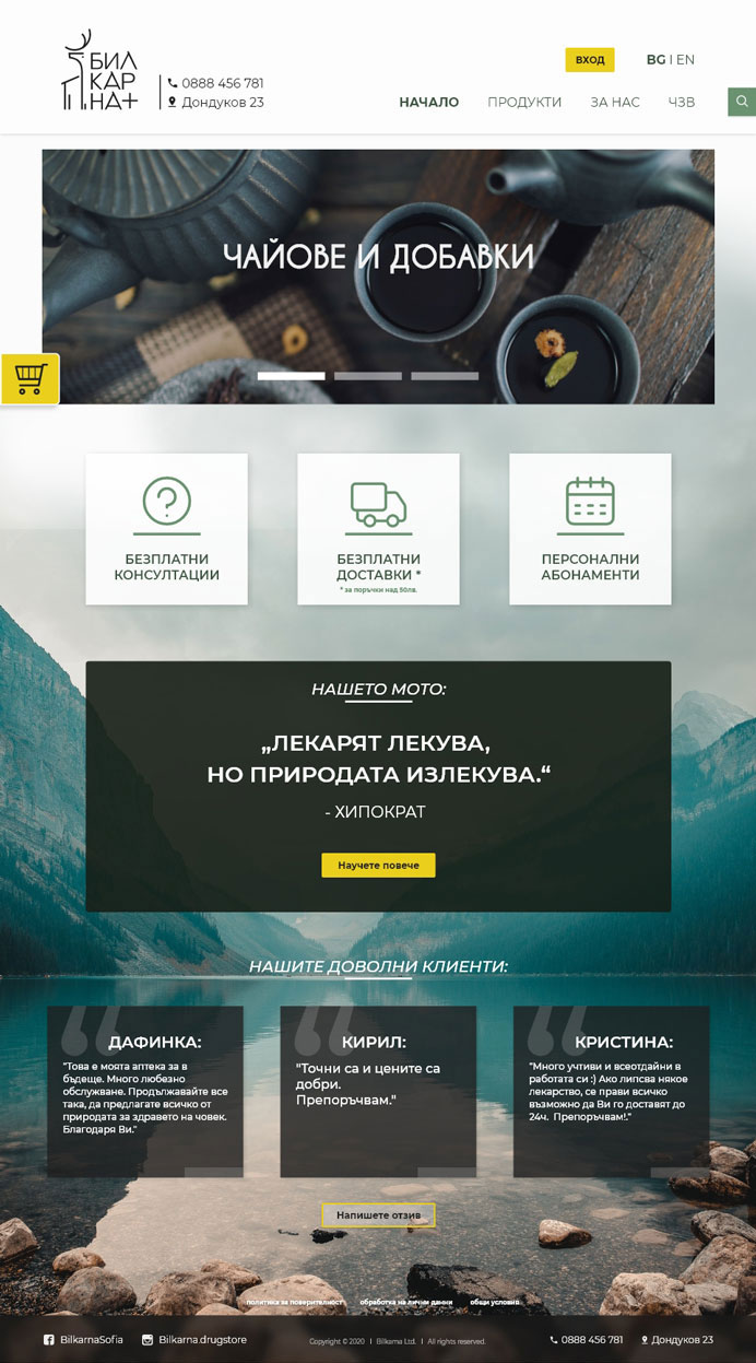
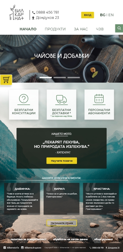
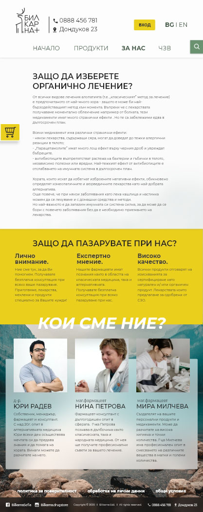
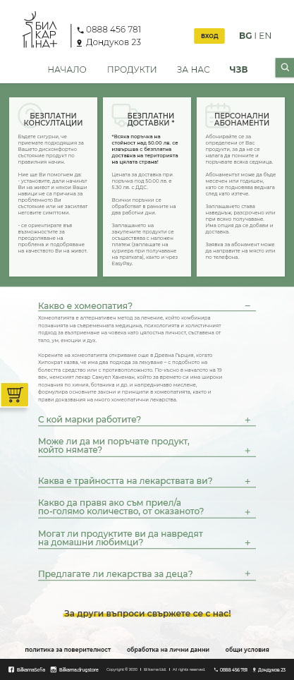
▪ provide information about organic medicine advantages over modern drugs;
▪ expand customer base;
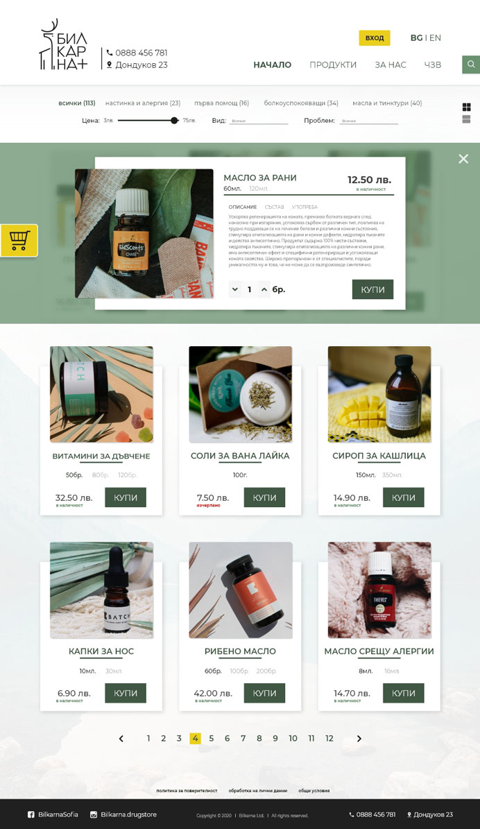
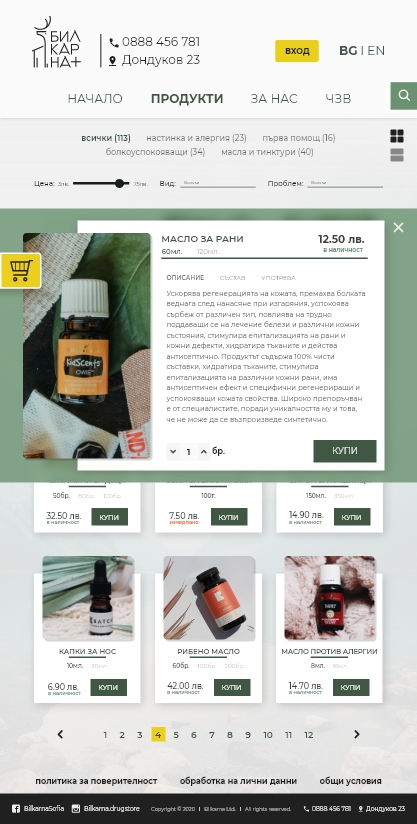
▪ fulfill online shopping;
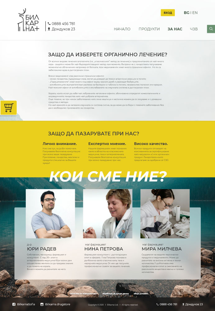
▪ earn credibility by acquainting users with company vision and mission.
▪ generate online revenue;
▪ increase sales by promoting products and providing online services;
▪ promote products and discounts;
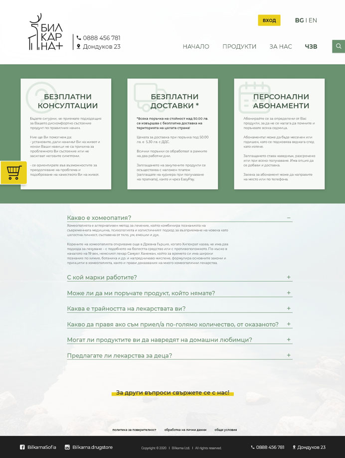
▪ promote customized remedies;
▪ senior friendly, but modern website.
▪ ages 20 to 50;
▪ open to alternative medicine;
▪ conscious about their health condition.
▪ hard to provide online shopping;
▪ inability to provide information;
▪ difficulty reaching more users.
To build better emphathy I needed to imagine my client as well.
So here's a bit
about him:
▪ he owns and runs a little pharmacy store - the family business built by his grandparents;
▪ they've been around for 58 years, providing organic cures for any disease;
▪ his job is his legacy, he's vastly dedicated to the business.
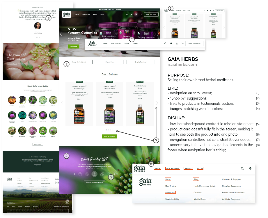
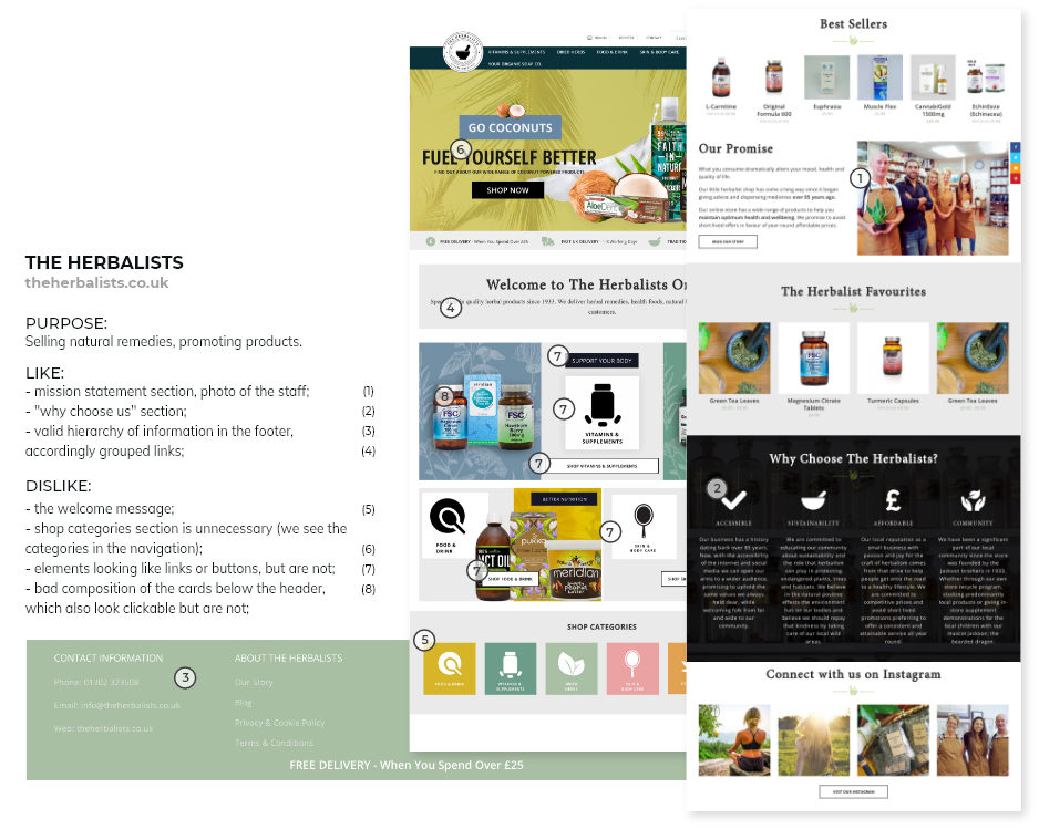
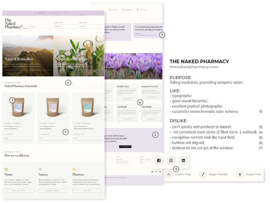
I choose 3 websites providing similar products and services to the one I'm designing and analized their:
▪
layout - to gather the scope of main page design;
▪ content - to identify what they do
well and what they can improve.
I did some brainstorming on elements positioning, shape consistency and information and removed all the unnecessary elements. Rearanged what's left and resketched the final idea:
The logomark shows The Deer Ancestor - a symbol of health and nobility.
For the Thracians it was impersonation of everything strong and powerful that protects and defends.
The logotype is a wordplay with the first Bulgarian word for pharmacy - "lekarna" - where the root "lek" means cure.
Therefore I named the brand "bilkarna", where the root is "bilka" - the Bulgarian word for herb, so the name would
translate as "curing with herbs".

